IPTV Platform
Product Design

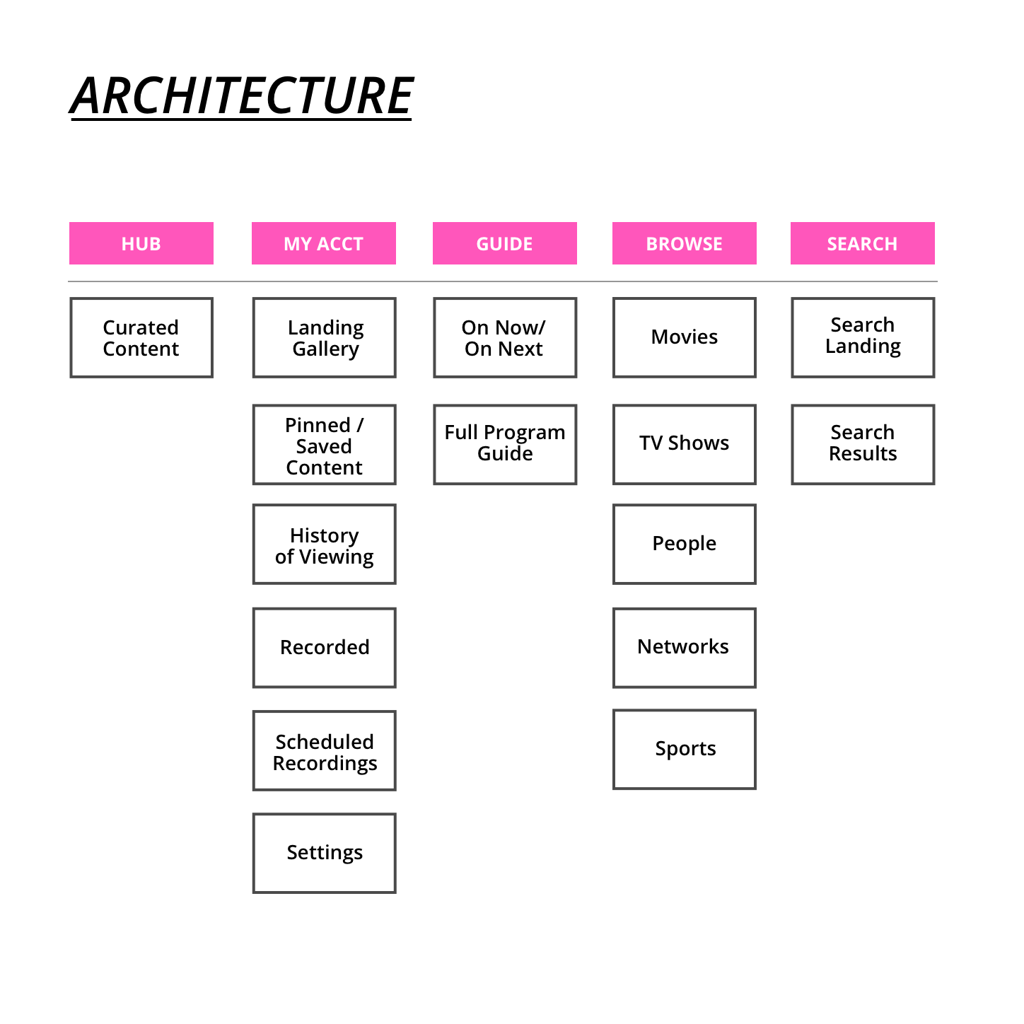
A Whitelabel TV Platform
While I was contracting at Moving Brands, the studio was approached by a creative director from Media Room to work in tandem with their in-house team to define a whitelabel TV system, that could be branded by licensed parters. To start, our team included a Creative Director, a project manager, myself and 2 other designers. For the second phase of the project, as we extended into creating finished production assets, we had a design director and another designer join us.
Our goal was to help the in-house design team reimagine the TV experience, and create a system that would help people discover content faster, rather than getting stuck navigating all the choices. Our deliverable was a new interaction model, with a defined visual language and a consistent motion language throughout the product — to be demonstrated through a prototype of certain defined feature flows.
Interaction Model Sketches & Wireframes
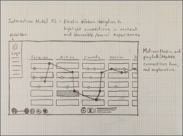
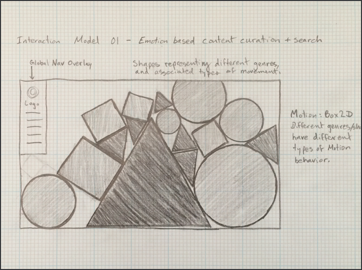
We started by sketching alternate interaction models to reimagine TV navigation. We aimed to create a system based on the viewer's watching needs and intentions rahter than not based on the cable providers catgories as traditional TV had been defined. We chose to focus on aspects that directly impacted the viewer — things such as length of time for watching, and the desired mood of the content. The interaction sketches below are some of the ones that I sketched and contributed.
My thinking behind these interaction models was to try to minimize decision fatigue for viewers. I hoped to infuse a more playful way of navigating content while focusing on the viewer's mood, as the central pillar to content discovery.
The interaction models that I sketched were intended to match content to the viewers’ feelings, rather than forcing the the viewer to choose from traditionally define categories of content that are defined from a film-making perspective rather than how it makes you feel through the viewing experience.
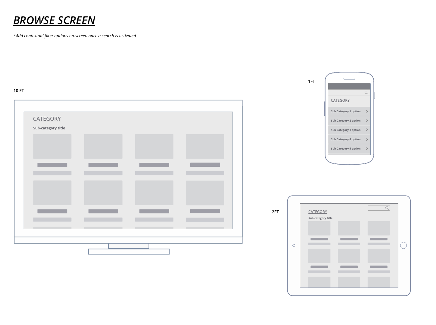
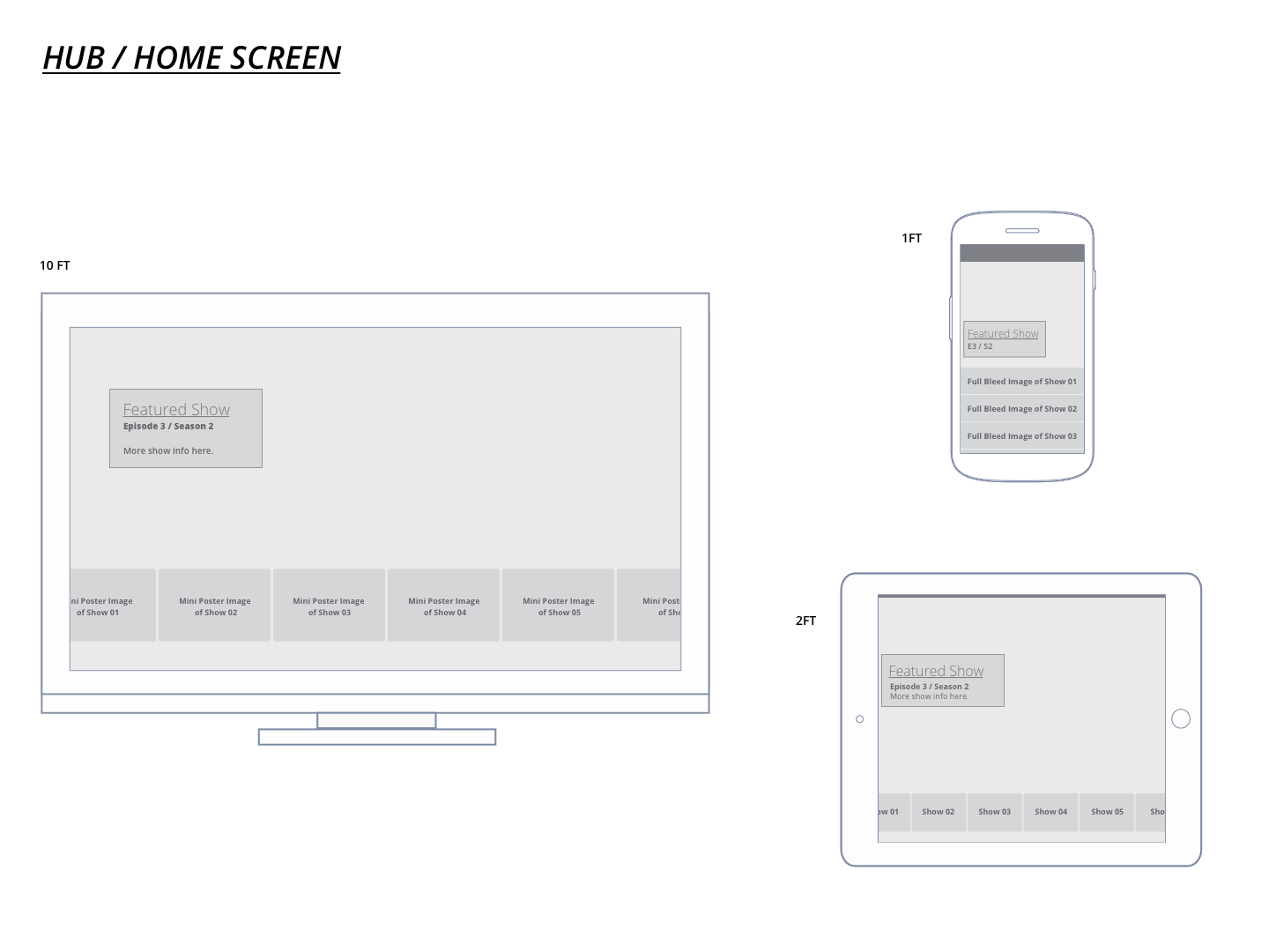
Look & Feel Designs
Myself and the other two designers, each designed a unique visual design direction for the 'Home', 'Browsing', and 'Search' screens across three devices (TV, iPad, and Android Phone).
We presented our look and feel designs to the executives at Media Room. They chose the cinematic look that I designed, and the information hierarchy from one of the other designer’s explorations. We began working on trying to incorporate the chosen design attributes to create a more detailed system that accounted for factors such as localization and a more flexible color system for partners to infuse their brand elements into the product in a consistent way.
The designs below are my visual design direction for the 'Look and Feel' visual design explorations. My goal in these designs was to bring the content forward, and where possible make the content itself represent the navigation of the system, in an effort to reduce the decision fatigue that was resulting from endless channel surfing.

Visual Design Process
Designing the visual system was a unique challenge in that it was a whitelabel product that local cable providers would use with their own branded content.
To make the design system work well with all the partners’ branded content we needed to use color in very minimal ways. We had to think of it as an accent that would be able to work in any brand’s color, rather than as a fixed identity element. For the typography and information design we needed to consider the localization constraints of all the different languages that the system might ultimately need to accomodate.

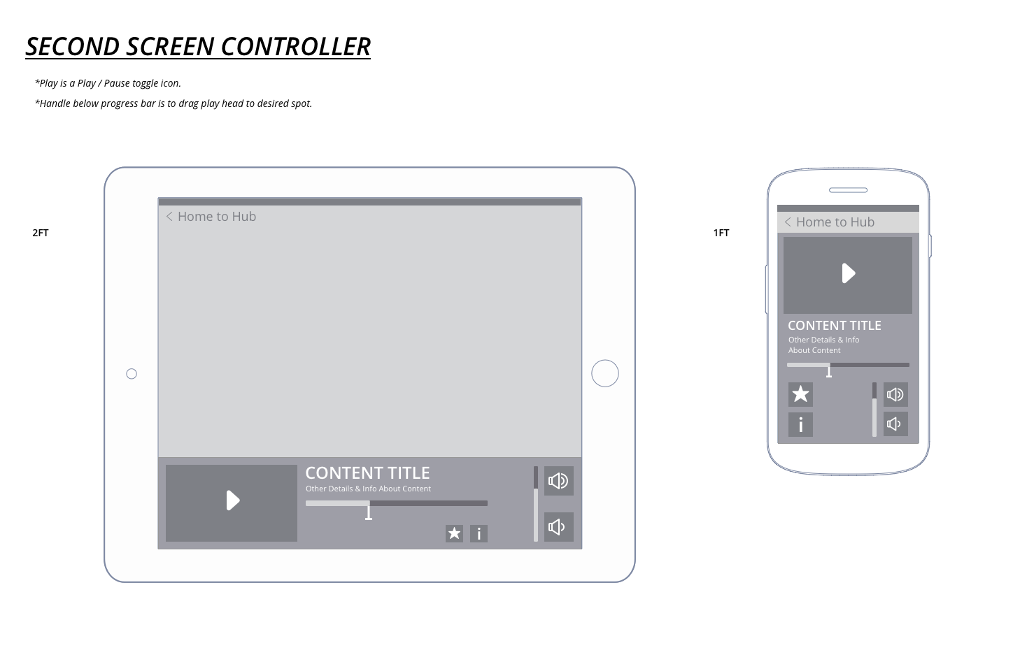
Production Design
I worked with the two other designers, and the Design Director to layout out screens and UI elements required to prototype the flows that were our agreed upon deliverables for the second phase of the project.
Once we had the initial screens designed, I began to work on explorations for the motion behaviors of the UI. Simultaneously the other designers were extending the visual design to all of the screens required for prototyping the selected flows.
The following screens are ones that I worked on collaboratively with other designers on the team. I worked on the style of the imagery and grid system on these screens, the menus and icons were an extension of work guided by the Design Director.

Prototyping Flows & Motion Tests
The motion prototypes were at first to explore how the interactions could work and flow through transitions, as well as to define the personality of the system.
Through this phase I worked with another motion design who handled prototyping flows for other devices and orientations. The landscape tablet motion samples below are ones that I animated.